Empower my brand
Empower my brand

Learn about the User, before you Leap to Reply

You’d recall several incidents where brands responded to consumers without understanding their context or who they were.

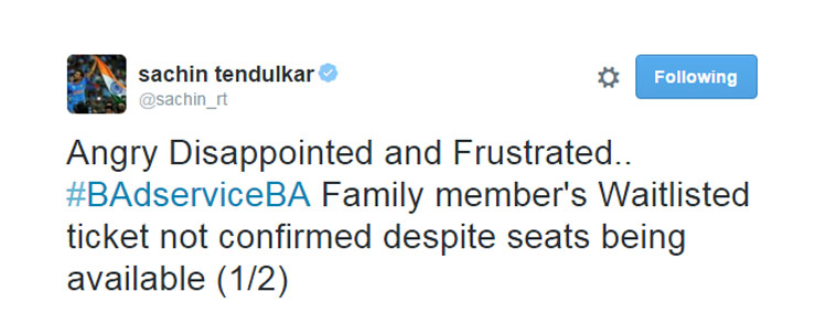
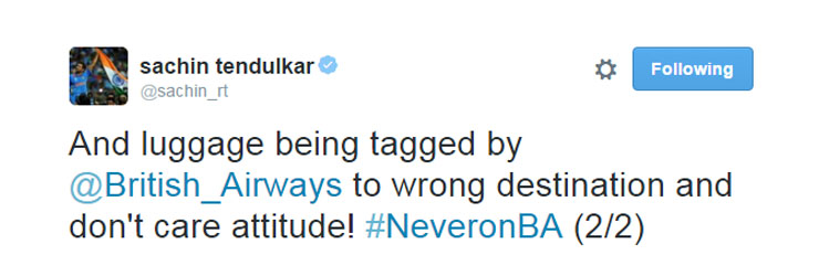
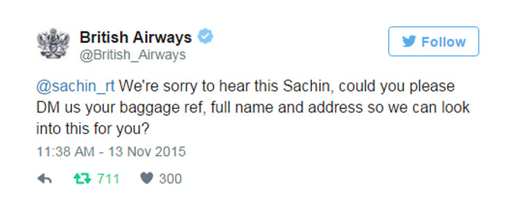
One recent example was when the great cricketer, Sachin Tendulkar, complained to British Airways on Twitter, only to receive a canned response from the brand’s official handle. Not unexpectedly, all hell broke loose with thousands trolling the brand which came across as naive and cold. The brand was responsive, but also blind, in a manner of speaking.

Sachin British Airways tweet 1

Sachin British Airways Tweet 2

Sachin British Airways tweet 3

What is the ideal way to respond to a user? Ideally, one should understand the user’s context and only then reply. Learn before you leap to help. Consider these questions:

  1. Would you respond the same way to a loyal, engaged customer vs. a first-time customer?
  2. Would you respond the same way to a celebrity as to all others?
  3. Would you use the same reply text to someone who has already complained about an issue a few times and is following up?

The challenge in the increasingly digital world where conversations happen rarely in person, less on the phone and more on social platforms is the expectation that brands respond in a humane, warm manner. The expectation is that brand’s response is not automated and cold. Remember, most often users reach out to a brand when something has gone wrong. An automated response can only make matters worse.

How does Auris help?

So, here’s where Auris helps – it provides the context of the user before you’d use the platform to respond. The context enriches your understanding of the user at three levels.

  1. Helps you understand the user’s history with your brand – all the interactions the user has had with your brand.
  2. Helps you understand the user’s sentiment for your brand based on the previous interactions. So you know if the user has been happy, neutral or unhappy with respect to his/her interactions with your brand
  3. Influence score. How influential is the user? This can help you prioritize and escalate appropriately.

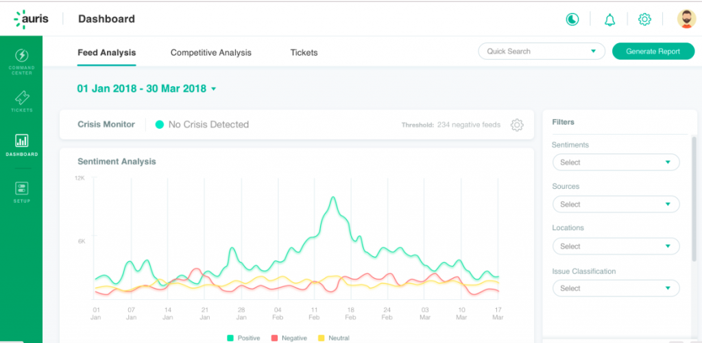
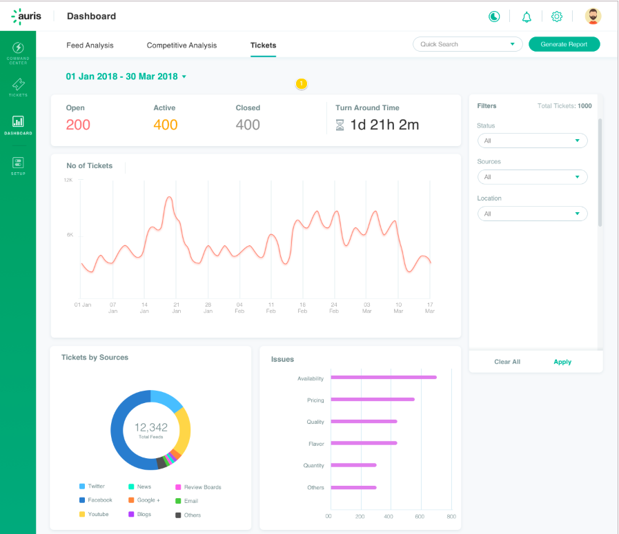
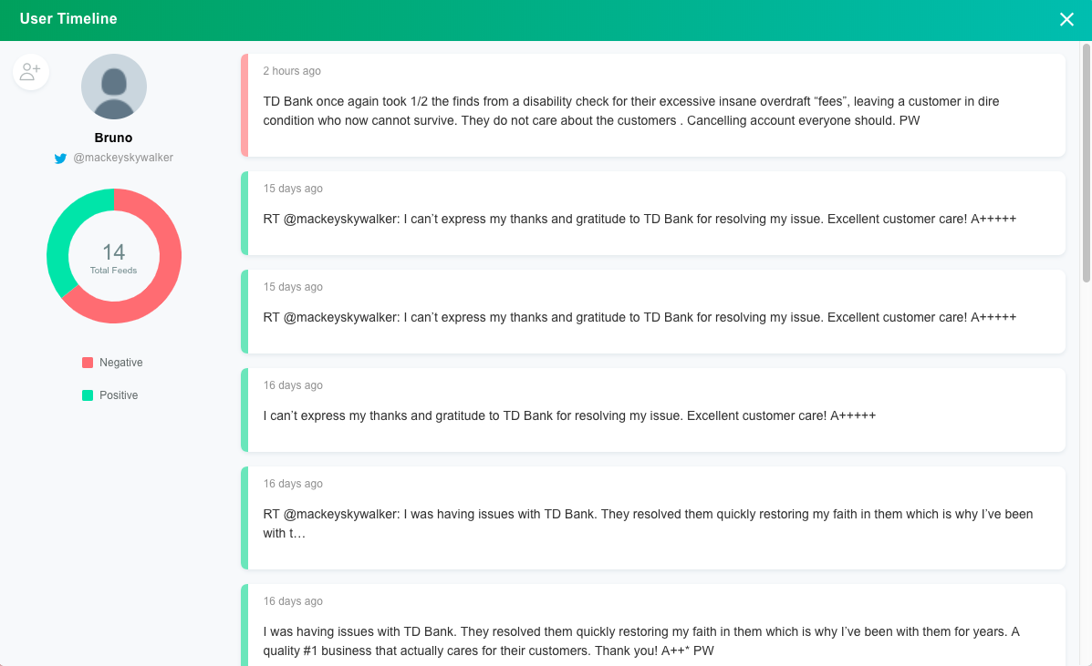
How do you know the user’s context on Auris?

It is easy and can be done right on the command center. Click on the top right (the three dots) of the comment card and click on the “User Timeline”. You’d have everything you need. The history, the sentiment as well as the influence score. See a real example below.

Auris User timeline example

Being responsive is great. But sometimes an insensitive, cold response, however fast it came through, could hurt the brand rather than help. Our advice to brand custodians? Look and learn before you leap!


The Dashboards of Auris: What Stories do they Tell?

Dashboards provide a 30,000 feet view of your brand’s performance. They help you understand the health of your brand, consumer issues and the demography of your audience. You can also gain competitive insights and access high level customer response metrics. Let’s look at the various sections of the dashboards of Auris in detail so users can understand them better and make the most of the platform.

Brand feed analysis

This tab displays data which will help you understand the overall health of your brand on date, as well as over time. The dashboards vary by industry (given that Auris provides industry-specific analytics), but some things are common to all accounts.

The common output includes an overall buzz volume chart, sentiment trendline, root cause analysis and audience demography. This information reflects on the overall performance of your brand and throws light on the drivers of that performance, both good and bad.

buzz volume and sentiment chart

Any spike in negativity warrants a deep-dive analysis; whereas an increase in positive engagement implies that the campaigns you are running are doing well. Perhaps there is a positive news story on your brand, being shared and doing the rounds? This sentiment chart is truly a summary chart and reflects the outcomes of what has already happened.

tag cloud social listening

The other charts go beyond the outcome. They help you understand what caused the outcomes. For example, what issues dominated the buzz, what locations saw a good amount of chatter and which channels contributed. Therefore, the charts decipher the underlying reasons which might have led to a positive or negative trend.

Audience demographics social listening

The dashboard comes with filters which help you understand consumer issues and online chatter better. For example, you could choose a combination of negative sentiment by location to understand the concerns your consumers have in that location.

Competitive analysis

The second tab on the dashboards helps you understand your competition. This maps your Share of Voice (SOV) and Share of Engagement (SOE) against that of your industry peers. You also get to understand the kind of content that helps drive up the engagement. This dashboard will also provide you with media spend insights, which is another input you will find useful to track.

competitor dashboard SOV SOE Spends

A combination of these metrics reflects on the performance of your brand  against that of your peers and offers insights into the opportunity areas where you can improve your performance. Learn more about how you could put such insights to use here. Understand how to add competitors to your account here.

Tickets

The third tab on the dashboards relates to tickets. If you use Auris to raise and resolve tickets and even if you use a 3rd party ticket management platform (ex. Zendesk), you see the statistics related to turn-around time, issue type, locations, agent productivity and other details here. These are metrics which reflect your brand’s performance on responsiveness.

social crm ticketing dashboard

Creating specific dashboards on the fly.

You can also create very specific dashboards on the fly. For example, you could create dashboards related to a specific product, sub-brands, locations, brand campaigns and monitor those. All you need to do is to create what are called ‘saved searches’ or trackers. More on that later.

The dashboards within Auris are developed specially to provide marketing decision makers with all the information they would need, to understand the brand’s context and take strategic or operational actions. Sign up for a free trial and try the platform’s dashboard on your own!