Dashboards provide a 30,000 feet view of your brand’s performance. They help you understand the health of your brand, consumer issues and the demography of your audience. You can also gain competitive insights and access high level customer response metrics. Let’s look at the various sections of the dashboards of Auris in detail so users can understand them better and make the most of the platform.
Brand feed analysis
This tab displays data which will help you understand the overall health of your brand on date, as well as over time. The dashboards vary by industry (given that Auris provides industry-specific analytics), but some things are common to all accounts.
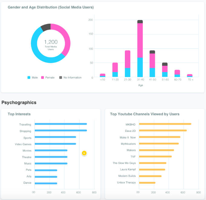
The common output includes an overall buzz volume chart, sentiment trendline, root cause analysis and audience demography. This information reflects on the overall performance of your brand and throws light on the drivers of that performance, both good and bad.
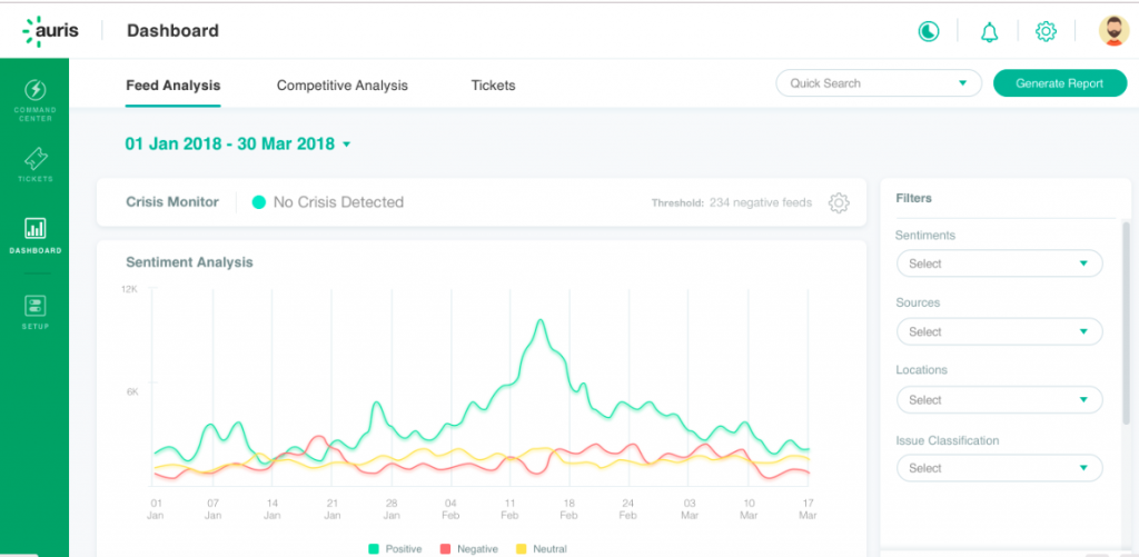
Any spike in negativity warrants a deep-dive analysis; whereas an increase in positive engagement implies that the campaigns you are running are doing well. Perhaps there is a positive news story on your brand, being shared and doing the rounds? This sentiment chart is truly a summary chart and reflects the outcomes of what has already happened.
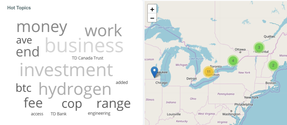
The other charts go beyond the outcome. They help you understand what caused the outcomes. For example, what issues dominated the buzz, what locations saw a good amount of chatter and which channels contributed. Therefore, the charts decipher the underlying reasons which might have led to a positive or negative trend.
The dashboard comes with filters which help you understand consumer issues and online chatter better. For example, you could choose a combination of negative sentiment by location to understand the concerns your consumers have in that location.
Competitive analysis
The second tab on the dashboards helps you understand your competition. This maps your Share of Voice (SOV) and Share of Engagement (SOE) against that of your industry peers. You also get to understand the kind of content that helps drive up the engagement. This dashboard will also provide you with media spend insights, which is another input you will find useful to track.
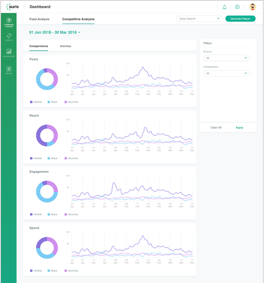
A combination of these metrics reflects on the performance of your brand against that of your peers and offers insights into the opportunity areas where you can improve your performance. Learn more about how you could put such insights to use here. Understand how to add competitors to your account here.
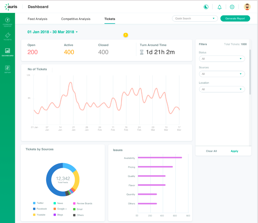
Tickets
The third tab on the dashboards relates to tickets. If you use Auris to raise and resolve tickets and even if you use a 3rd party ticket management platform (ex. Zendesk), you see the statistics related to turn-around time, issue type, locations, agent productivity and other details here. These are metrics which reflect your brand’s performance on responsiveness.
Creating specific dashboards on the fly.
You can also create very specific dashboards on the fly. For example, you could create dashboards related to a specific product, sub-brands, locations, brand campaigns and monitor those. All you need to do is to create what are called ‘saved searches’ or trackers. More on that later.
The dashboards within Auris are developed specially to provide marketing decision makers with all the information they would need, to understand the brand’s context and take strategic or operational actions. Sign up for a free trial and try the platform’s dashboard on your own!